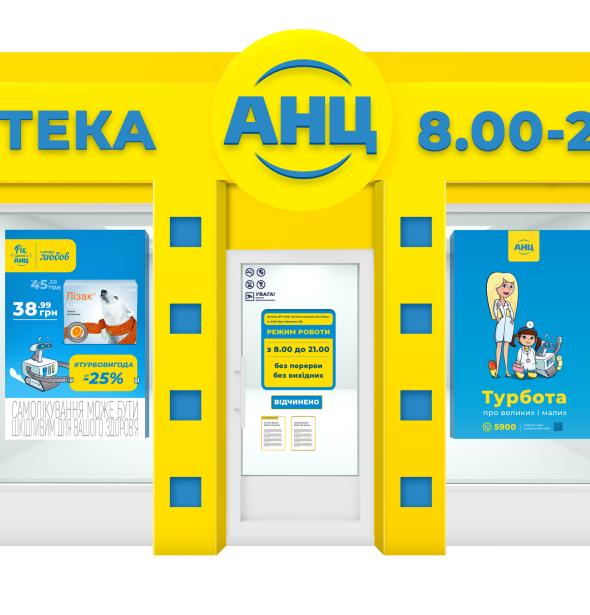
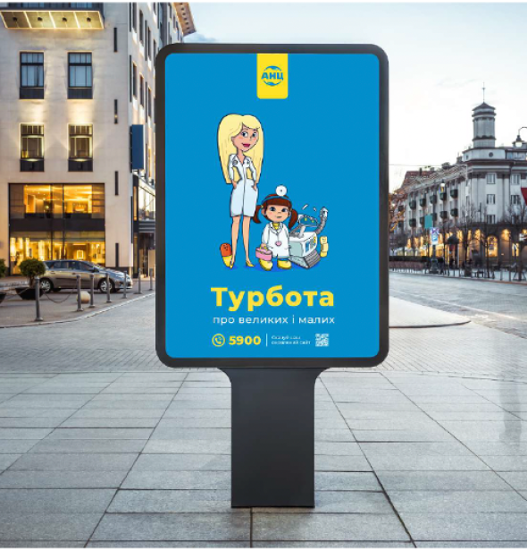
ANC is one of the biggest chain pharmacies in Ukraine with more than 1 300 locations in 182 towns.
16 million Ukrainians choose ANC.
With more than 7 000 employers ANC leads Ukrainian pharmaceutical industry.
In order to get to know ANC brand better, our team carefully studied all the processes of this pharmacy chain. After a while we made sure how much they care about health, comfort and benefit of their customers. That's really cool, because care is that very thing, that each of us wants to feel during a visit to the pharmacy. Therefore, we decided to set up the new communication strategy on the basis of the relevant brand archetype - "Caring".
The definition of the archetype helped us to embody the values of ANC brand in its communication. Thus, the feeling of care is transmitted in all its aspects:
For a more effortless communication between pharmacy and its customer, we’ve chosen a relevant tone of voice - friendly and open.
Even more, we've also developed new and noticeable communication message for ANC - #turbobenefit. Thus, we inform about lots of turbo-offers for ANC customers, as well as emphasize turbo-prompt service of the pharmacy chain.
In addition, depending on a certain month, ANC uses new creative messages in brand communication. They help to highlight one or another season according to a particular holiday or special offers for clients: "Love Station" in February, "Attention, spring is coming!" in March, and “Beauty Station” for communication in April.
Also we're glad to introduce a brand character - a robot. We've created a visual character, who illustrates pharmacy's innovations and tells customers about ones in a more interesting way. We remind you that ANC is the first robotic pharmacy chain in Ukraine. Most of their stores aren equipped with Pharm Bot robots, which instead of a pharmacist gives orders to customers in a few seconds.
To create a single branding style, we developed detailed guidelines, illustrating several positions of all the characters’ bodies, as well as all necessary colors for printing and working with multimedia devices. In future that will help optimize work of designers and animators, who will create visual materials based on these characters. We prepare a new batch of stickers for ANC clients every month. You can get them at the nearest pharmacy of the brand.
Also, ANC pharmacy has a dream: to make the world kinder. That’s why our brand characters are getting closer to this dream in small steps - or rather short animated videos. Each story tells of a certain lifehack on how to take care of each other.
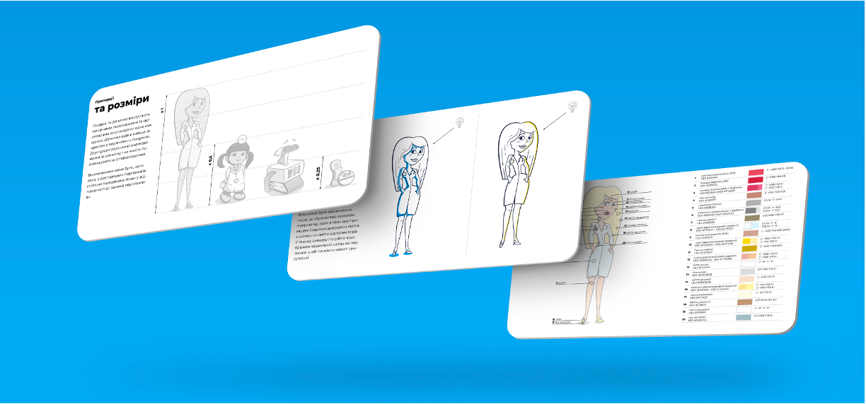
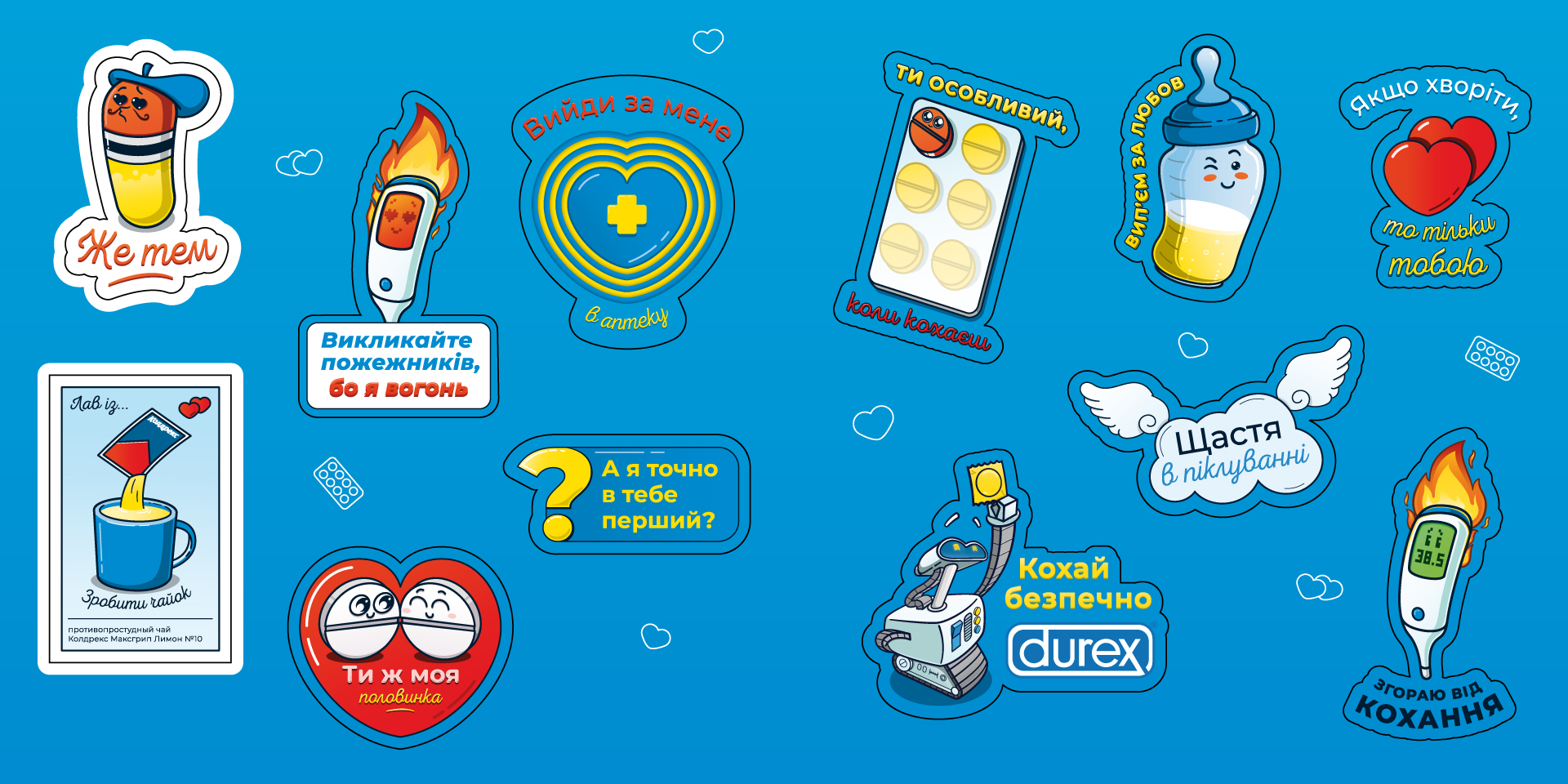
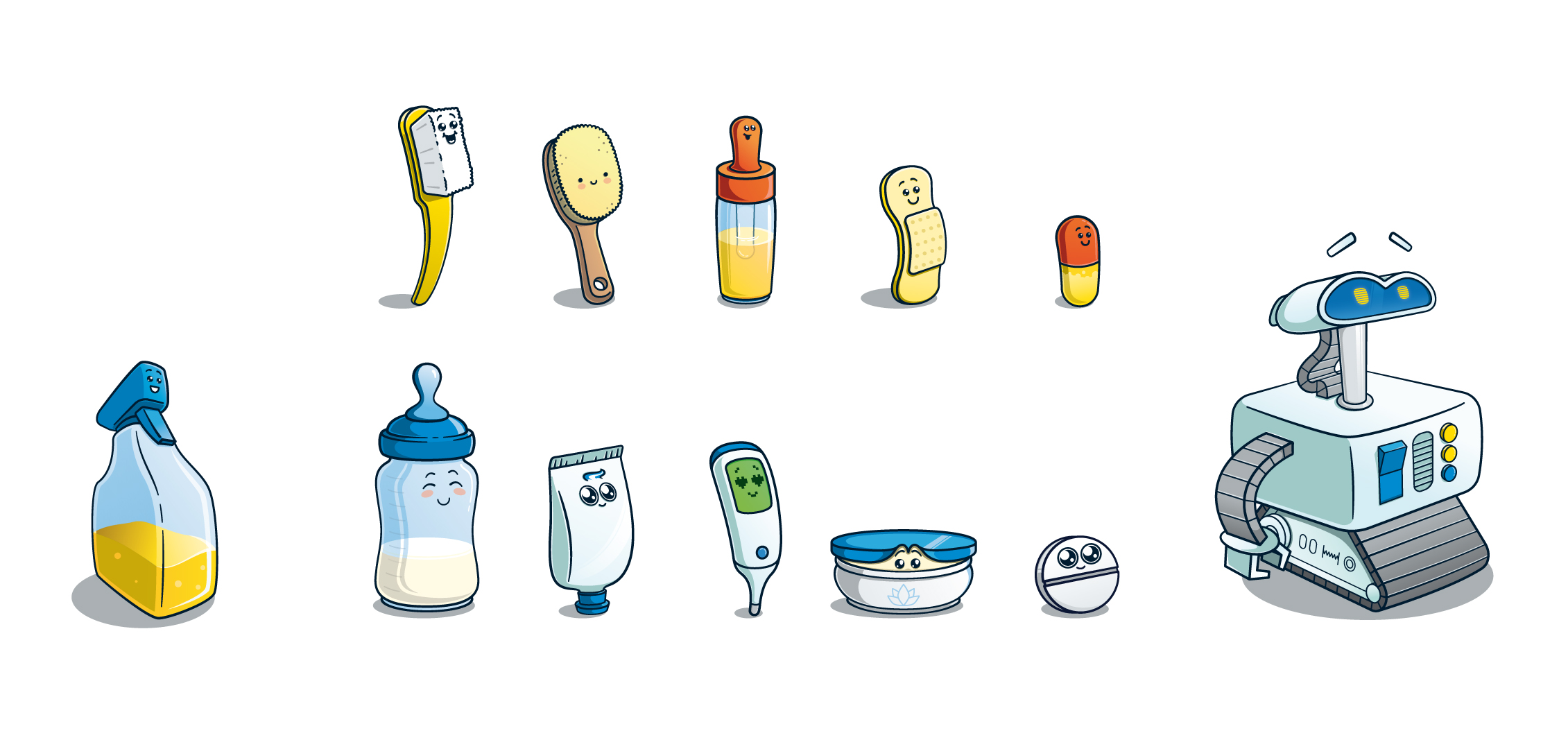
We’re glad that as a result of our cooperation new faces have appeared in the family of ANC brand characters. First of all we focused on a visual style. In order to convey the emotions of care and warmth, we decided to choose cartoonish style. This is how the author's graphic illustration was created - a unique one, fast readout, and seems like bringing to a childhood. The number of visitors to the pharmacy has increased even more, because care is now present in all manifestations of the brand.