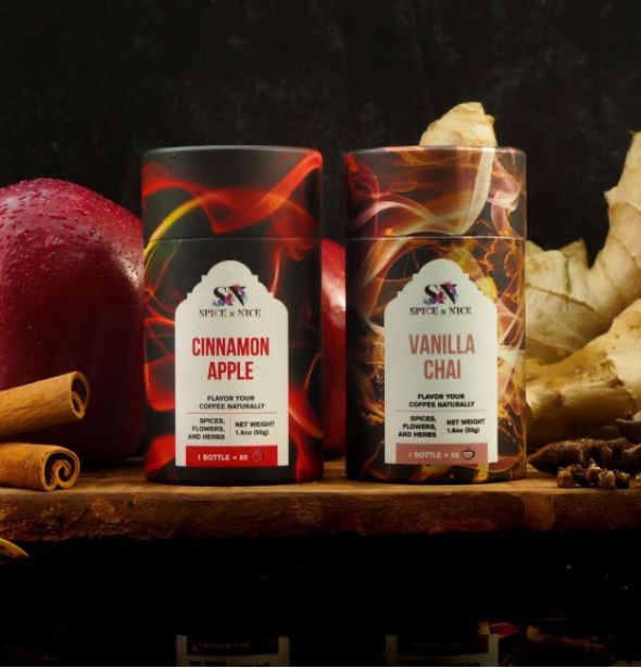
American coffee flavoring brand.
Design Objectives: The primary goal for this project was to create distinctive and eye-catching packaging design for the product. The challenge was to make the design instantly recognizable and stand out on the shelves among the sea of black coffee packages and colorful tea packages.
Design Concept: In order to differentiate SPICE N NICE from its competitors, we focused on creating an original packaging design with a unique color effect.
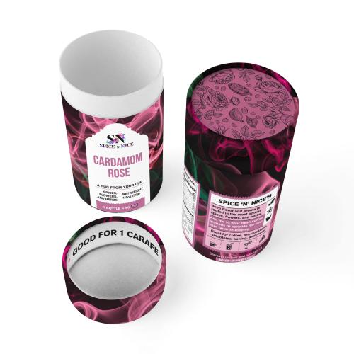
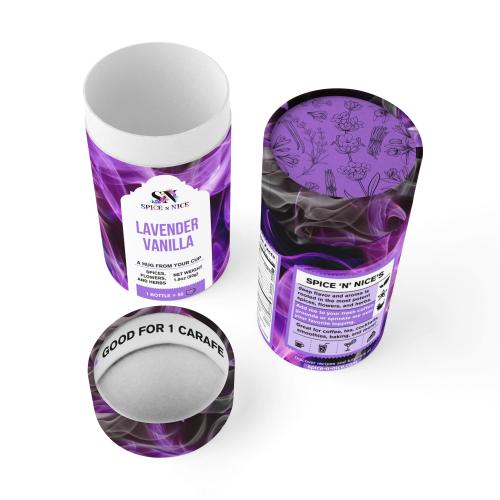
1. Black Packaging: To clearly convey the product's association with coffee, we chose a deep black color for the packaging. This instantly communicates that the product is coffee-related, as black is a traditional color associated with coffee packaging.
2. Colorful Smoke Effect: To visually depict the aromatic spices, we incorporated a colorful smoke effect into the design. This not only adds a touch of creativity but also conveys the idea of spices enhancing the coffee experience. The color of the smoke corresponds to the specific flavor of the product, making it easy for customers to identify and choose their preferred option.
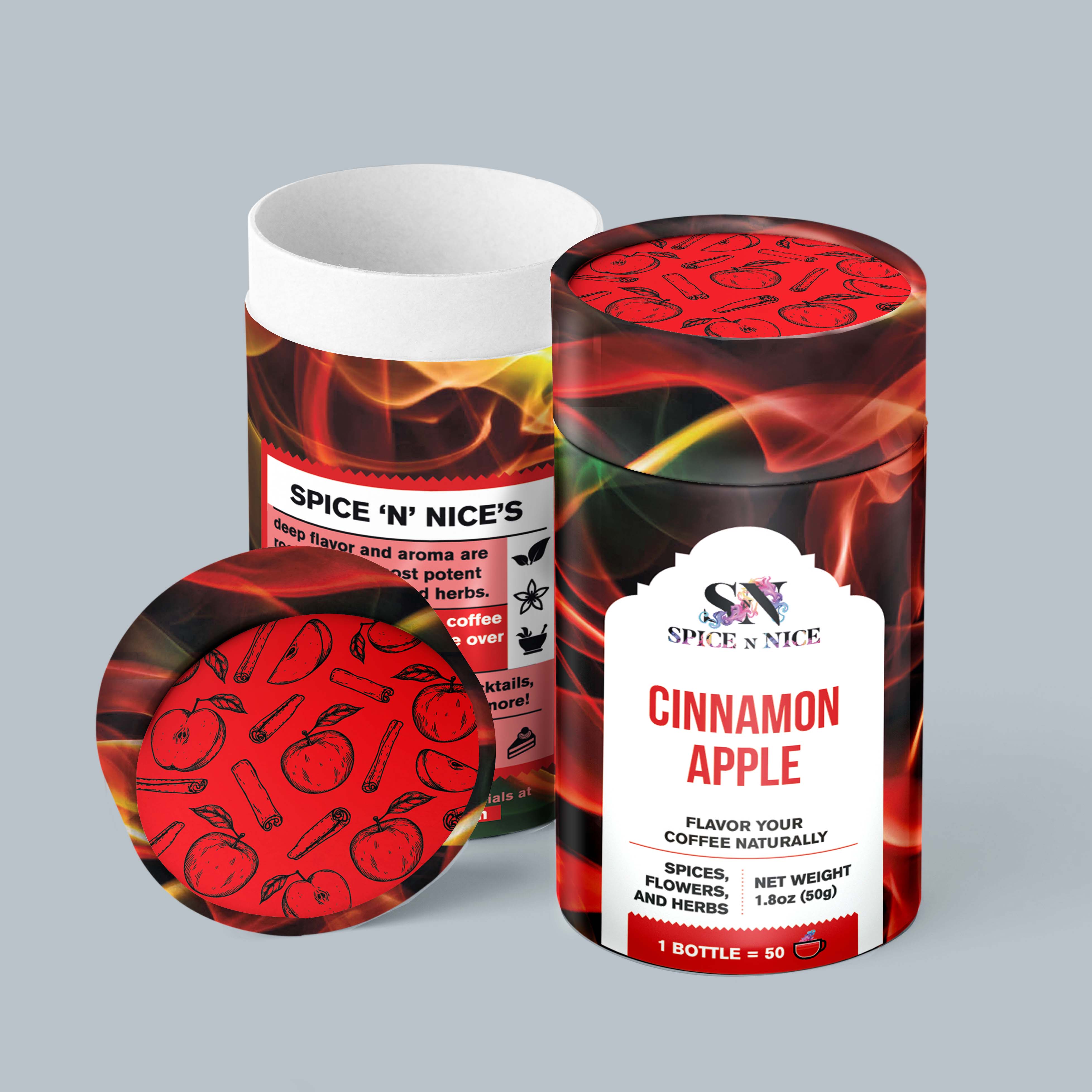
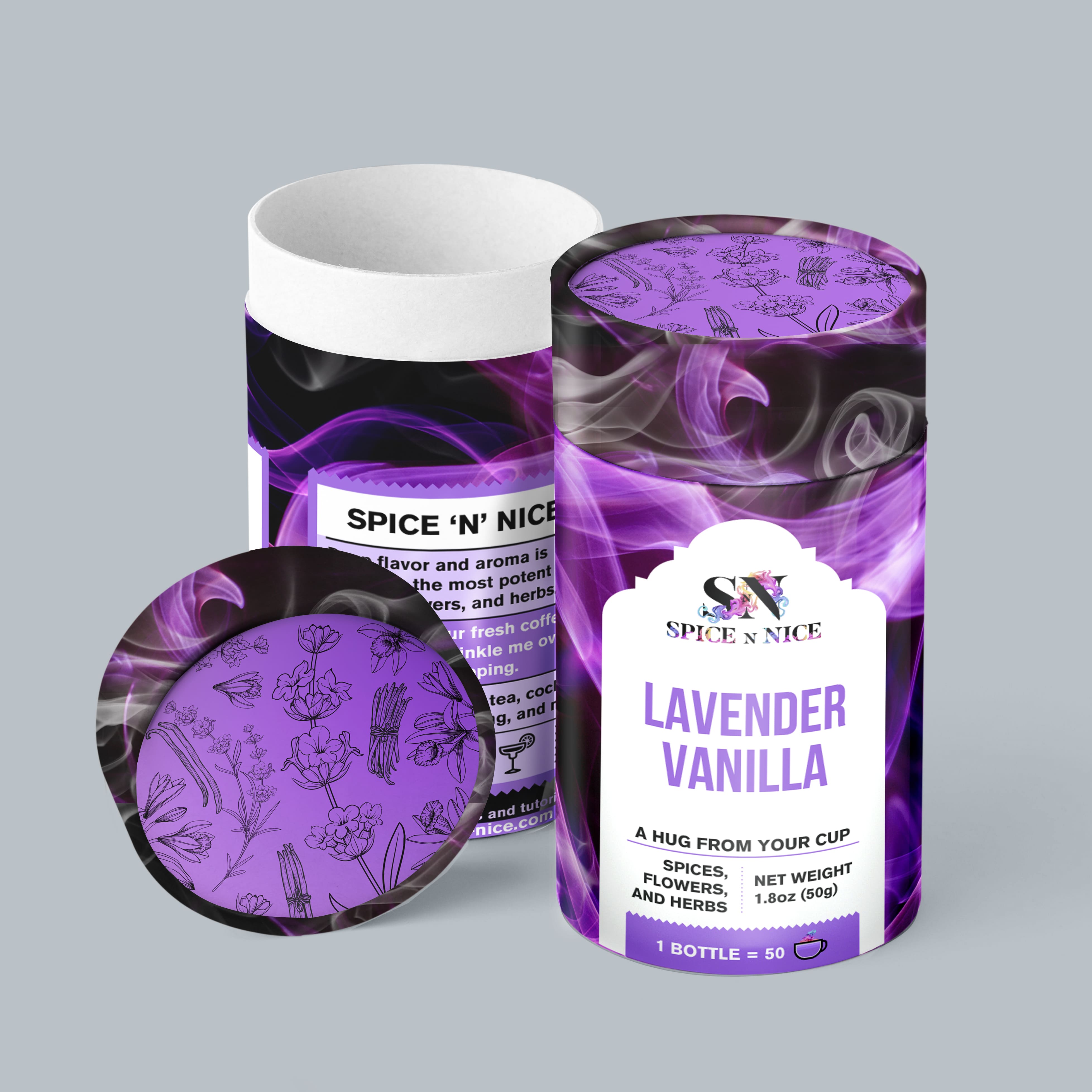
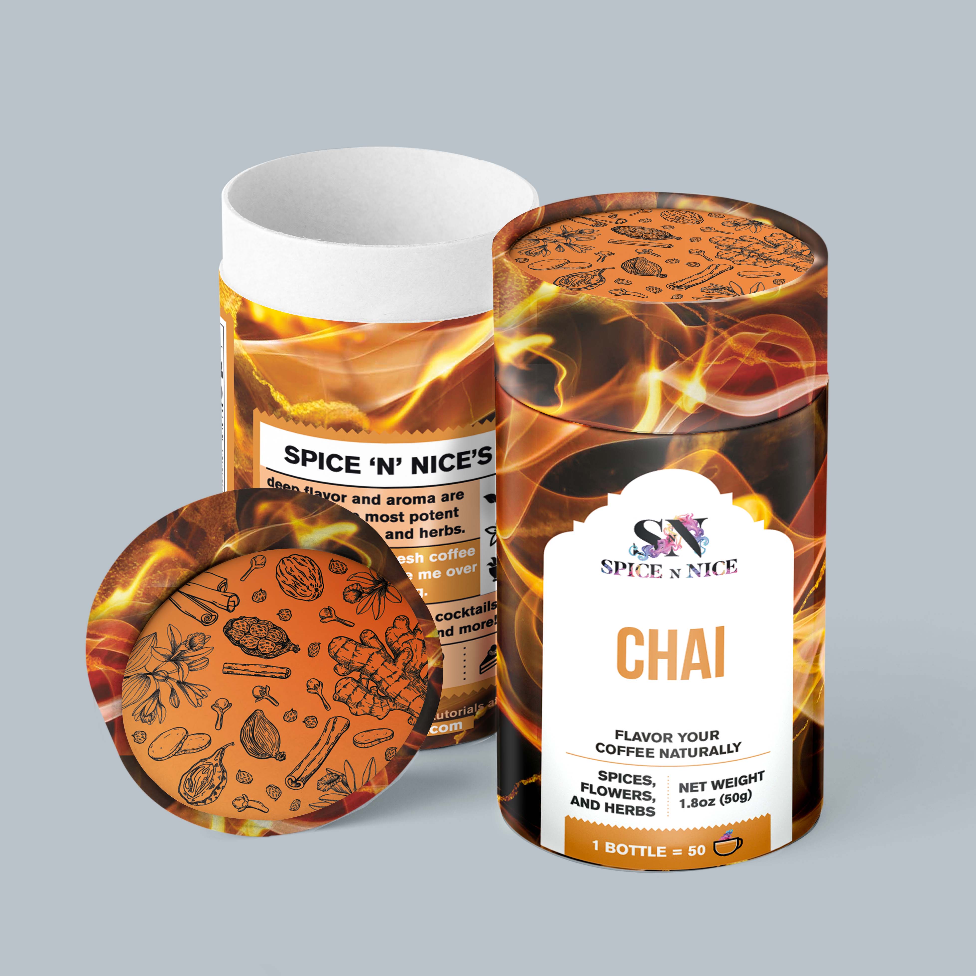
The black packaging sets SPICE N NICE apart from other coffee and tea products on the market. The colorful smoke effect not only adds a visually appealing element to the design but also clearly communicates the brand's dedication to enhancing the coffee experience with a variety of spice flavors. The design has contributed to the product's recognition and its ability to stand out on store shelves.
By implementing this unique and memorable design, SPICE N NICE managed to capture the essence of its product and differentiate itself in a competitive market, attracting customers with a visual identity that promises an enhanced coffee experience.